
I just love when we can geek out on design. Here’s something that caught my eye in the New Yorker talking about the backlash to the recent redesign of the iconic Milton Glaser “I Love NY” graphic.
So why all the tsuris? Well, first because what Glaser pursued, as I tried to suggest in that lengthier piece, and as he always insisted, was not drawing elegant graphics but thinking in images.
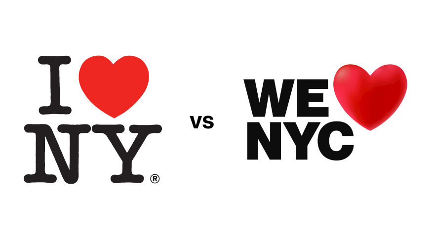
Similarly, the original “I❤️NY” logo—even though it was scribbled on the back of an envelope (and was originally, as I noted, intended to indicate the state, though it was quickly subsumed into the town)—worked so beautifully because that heart symbol acted as a hasty synecdoche for love, and this in a pre-emoji age when such rebuses were rarer than they are now. By compressing civic love into a single symbol, the design brilliantly caught the speed and dispatch of our city.
The new logo fails because, instead of summing up an emotion, it belabors an image. “NYC,” though an abbreviation used in official records and sometimes on mail, is unnatural to New Yorkers and calls up no sensitive synecdochic vibrations.
Adam Gopnik, New Yorker
It’s a good reminder for me that products also need to communicate – not on features or capabilities – but on the feeling and the outcomes that users desire; just a design isn’t about how things look.. or even how they behave, but a reflection of how we aspire to think about ourselves.